iOS 7 vs Android Jelly Bean - Which mobile OS will own 2013?
Does Apple's flat OS flatten the competition?
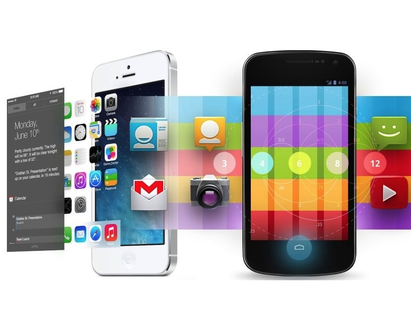
So, it's been about a week and a half since Apple unveiled iOS 7, the biggest overhaul of its mobile operating system since... well, ever.
It seems every vaguely tech-oriented website has had its say about the bold new look of iOS. It's gorgeous, it's hideous, it's innovative, it's a rip-off. Everyone's got something to say.
But the main question really has to be how iOS 7 stacks up against its biggest rival: Android 4.2 (a.k.a. Jelly Bean).
We're going to run through five key areas of the two operating systems - not including stock apps - to see how they compare at this early point.
Design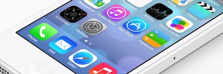
This is the most in-your-face point of the lot, and also the most subjective. Here in the UK, we suspect that plenty of Marmite analogies will be drawn in relation to iOS 7 over the coming months. People seem to either love its design or hate it.
Even on the beautifully harmonious and synced-up PG team (um...), there are those who fall very definitely on either side of the divide.
So let's deal with the facts here. Apple's iOS 7 design is certainly more modern than iOS 6. It's 'flatter,' which means that it features fewer textural effects and fewer attempts to make its various elements feel three dimensional.
Its app icons use simplified imagery and bright colours, while menu overlays (like the new Control Center) add translucency, allowing traces of those icons to glow through. Its various settings screens and default apps also tend to use more plain white backgrounds and stylishly thin fonts.
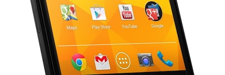
Of course, Google's Android Jelly Bean also uses plain icons, white backgrounds, and stylishly thin fonts. In fact, the Android OS design in its current form dates back to 2011, but that's not the issue here.
Jelly Bean really is a very pleasant OS to look at and use, though if anything it's actually more sober, elegant, and reserved than the flamboyant iOS 7.
Things seem to have flipped around when it comes to OS design. Google now appears to be turning out elegant, iterative UI designs while Apple looks set to act the part of the brash, flawed opinion divider.
Of course, when it comes to deeper features, it's not quite that simple...
Settings access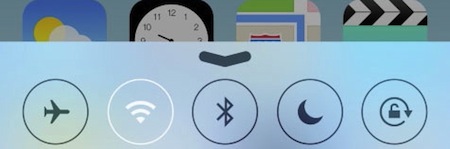
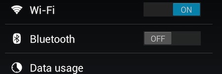
One of the biggest additions of iOS 7 - and one of the most-requested features since the first iOS back in 2007 - is the aforementioned Control Center.
This is a brand-new menu that you can gain access to by dragging up from the bottom of the screen, like an inverted Notification Center. This provides quick access to key settings toggles for wi-fi, Bluetooth, Airplane mode, screen brightness, music player controls, and things like that.
It's potentially the most immediately useful addition to iOS 7.
Android Jelly Bean has similarly strong settings access, and in fairness we should note that it's another thing Android has had for years. They work in a slightly different way here, though.
Those music player shortcuts appear in the notification bar (by your dragging down on-screen), while in the latest iteration you can gain access to a Quick Settings menu by dragging down with two fingers. This provides access to wi-fi, brightness, Airplane mode, and other related things.
The one-handed operation of the Apple version may well give it the edge here, though you can also get access to Android's Quick Settings by tapping an icon within the notification bar.
Multitasking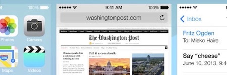
The other major addition to iOS 7 is true (or truer) multitasking. Currently, in iOS 6, a double-tap of the Home button will bring up the multitasking menu, but it's not really full-on multitasking. All you get are the icons of recently opened apps, the tapping of which may jump you back to the point you left them at with a little loading.
In iOS 7 these icons are expanded to full thumbnail previews of these apps, held in stasis at the point you left them. Apple says it will intelligently keep the apps you use most frequently running in the background, meaning you can jump straight back in without pause.
These thumbnails are listed in a horizontally scrolling carousel, which is quite different to the current stock Android experience. It's closer to HTC's Sense 4 approach, as seen in the HTC One X, or Palm's ill-fated WebOS before that. We like the look of it, and it's one of those vital updates that should genuinely enhance iOS's usability.
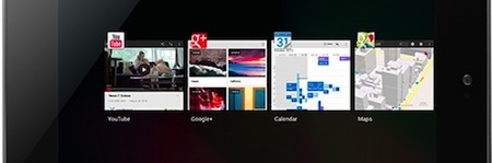
Android Jelly Bean uses a similar principle of showing you thumbnails of recently opened apps, but its access and presentation are a little different.
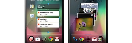
Viewed via a dedicated control at the bottom of the device, the thumbnails are generally arranged vertically on mobile (the above image shows it aligned horizontally in landscape on a tablet). You see less of each squared-off thumbnail, but the trade-off is that you see more of the thumbnails at once, making selection a little snappier.
Both systems allow you to dismiss or close stored apps with a simple swipe.
Notifications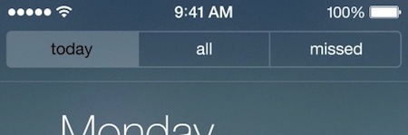
Notification Center was arguably the biggest addition in iOS 5 two years ago, but it's receiving a much-needed overhaul for iOS 7.
You still gain access to it by dragging down from the top of the screen, but the look and way in which your information is filtered has been tidied up. The main way this has been done is by ordering your notifications between three self-explanatory tabs: Today, All, and Missed.
The idea is to help you wade through all those Twitter updates you get and help you see those notifications that matter, such as calls you may have missed while in a meeting.

The notification bar in Android 4.2 doesn't split information in this way, but it does enable you to expand notifications, and even respond directly from some of them. For example, you can archive or reply to an email directly from here.
Another new feature in iOS 7, which again is already present in Android Jelly Bean, is the ability to gain access to your notifications from the Lock screen without having to unlock your device. In both cases it's perfect for glancing at your emails in a spare five seconds of a busy day.
One thing iOS 7 has that Android Jelly Bean doesn't is the ability to sync your notification actions, so acknowledging one on your iPhone will automatically update the notifications on your iPad. Having said that, Google announced that this feature was coming to Android at the recent Google I/O, so it's even stevens.
Glanceable infoBy glanceable information we do, of course, mean widgets - those expanded live icons that give you information without entering the apps. It's something that every modern mobile OS except iOS has had up until now... and iOS 7 won't change that one bit.
Apple seems set on its decision to keep its icons simple, static, and uniform. The clock and calendar icons might tell you the right time and date, but the weather app icon is permanently sunny (with a few clouds) and your reminders remain buried in the app.
Android Jelly Bean, by contrast, is the place to come if you like widgets. Whether it's weather, notes, calendar entries, the latest stories - you can get a wealth of up to date info without leaving the home screen(s).
You can place as many as you like across its numerous home screens, or even on the lock screen in version 4.2, and even resize them to show more or less information.
Of course, Apple would argue that there's a price to pay in terms of battery life, device performance, and speed of navigation. We think it's time Apple started offering more info up front, at least for the iPad, which continues to leave a lot of wasted space on the Home screen.
